An E-Design Project
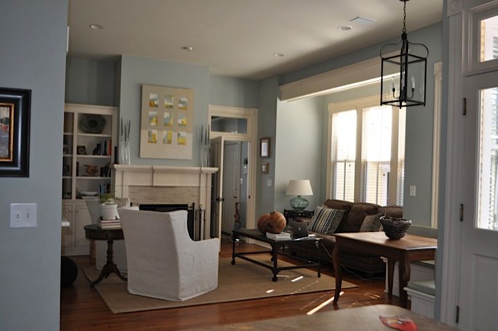
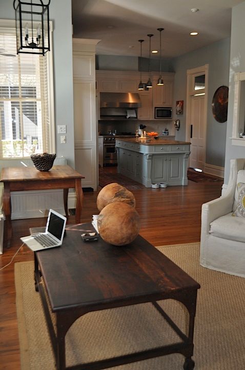
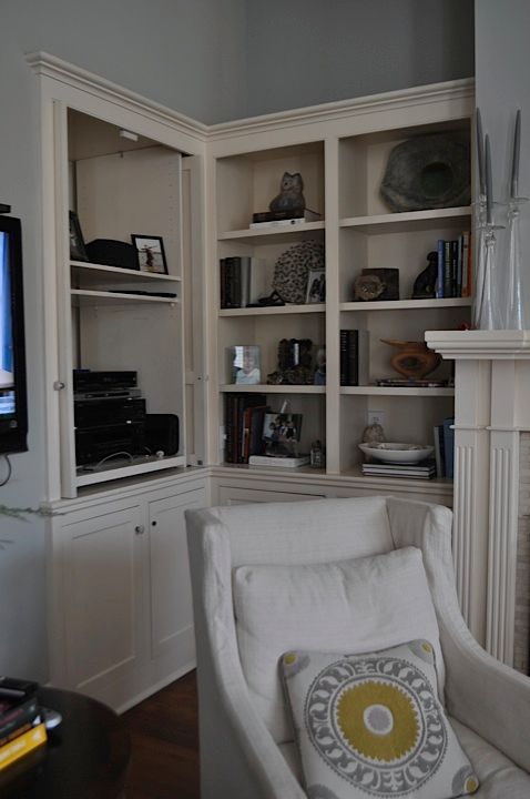
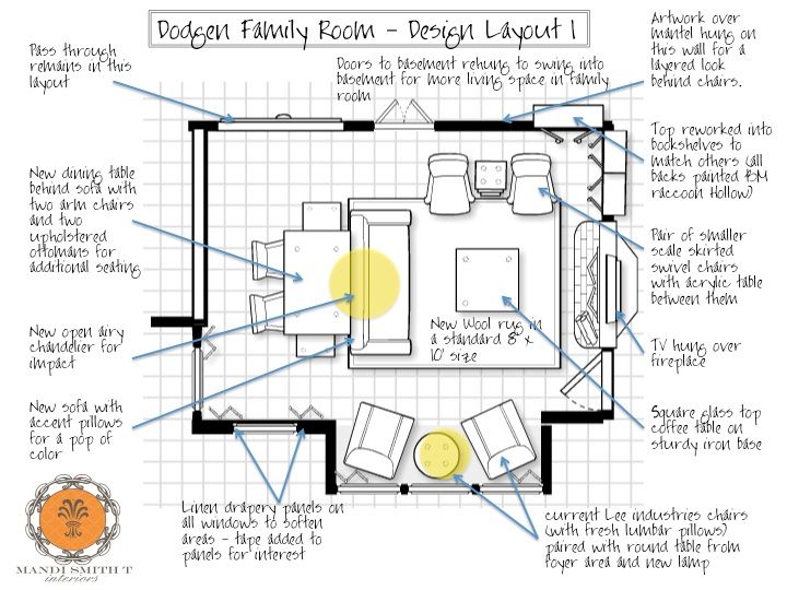
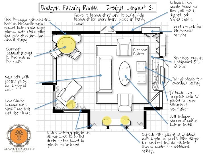
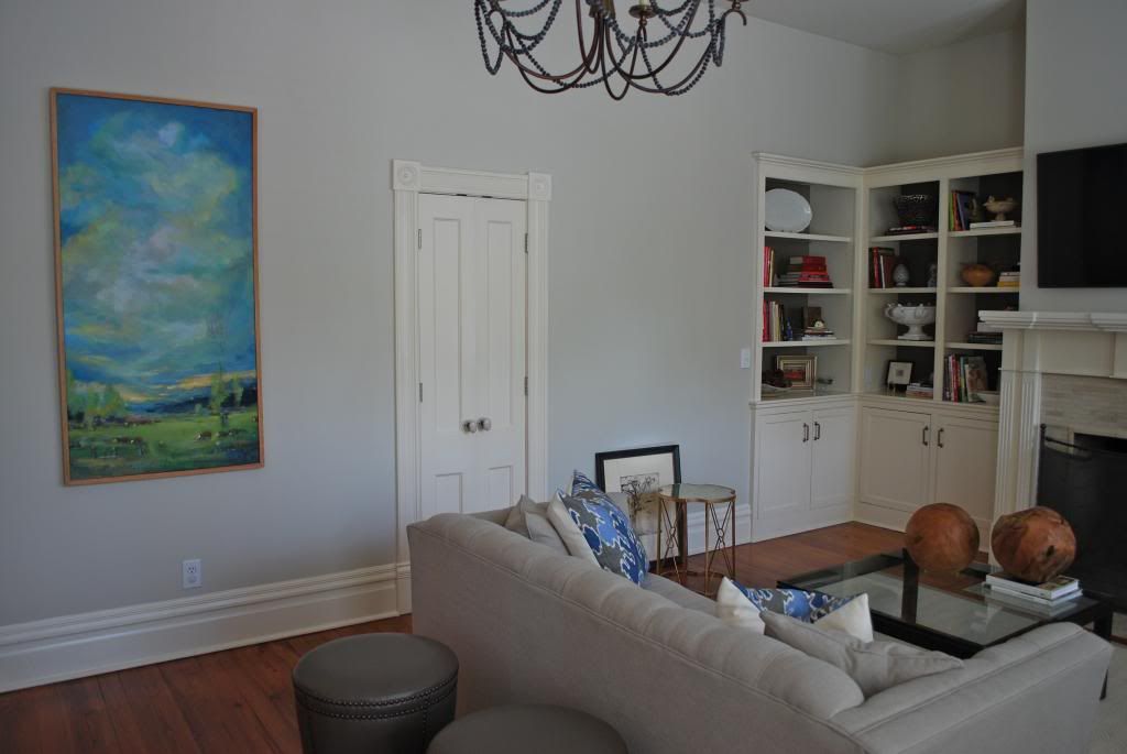
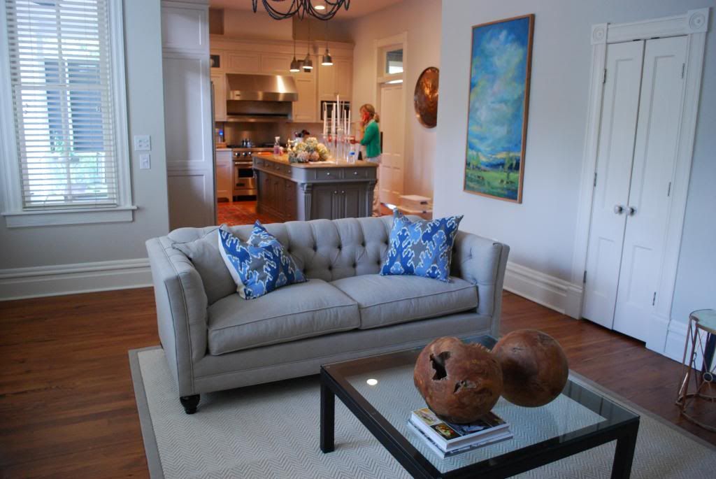
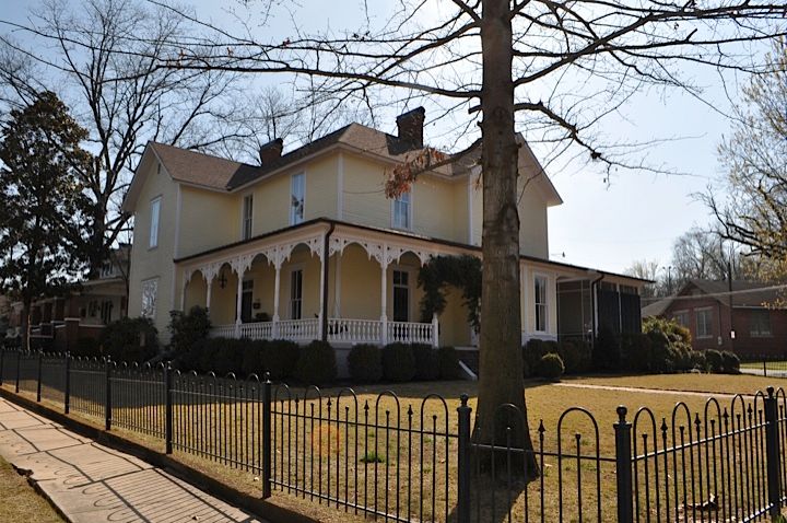 While the exterior of this house is very Victorian, the homeowners are a young, hip couple who are actually drawn to a more modern aesthetic. So, I was asked to come up with a new design for their family room that would satisfy their modern taste while still blending the Victorian style and antique pieces in the rest of their home. A tall order! But, I was completely up for it. I do confess, I spent several sleepless nights working on this project. The layout of the space was very difficult. These older homes have lots of little niches and details which add tons of character to the overall look of the home, but make furniture placement for practical living incredibly challenging.
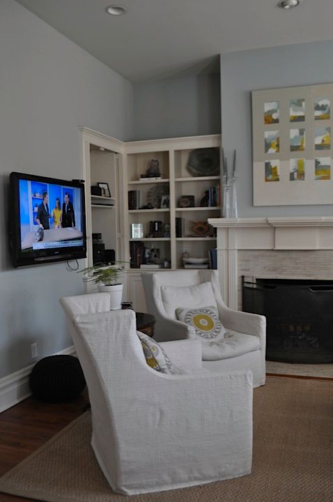
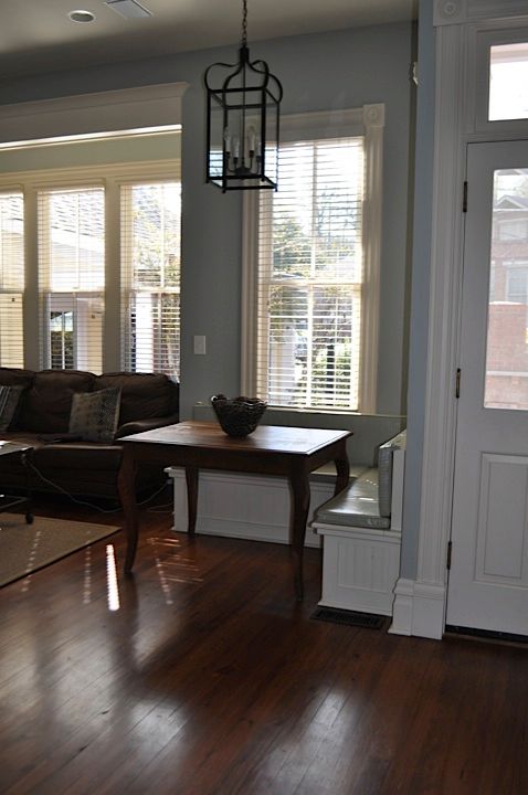
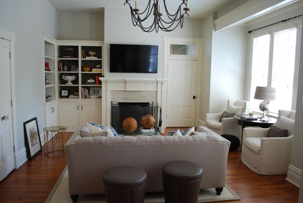
My clients decided to go with Option 1, but with one small revision (based on option 2). They made the decision to go ahead and remove the pass through to the bar. This allowed for more wall space in the new design for artwork, and for the addition of upper cabinets in the new butler’s pantry (rather than “bar”) area. Also, notice in both designs, we removed the banquette. Now, I realize this move may seem counter intuitive to some of you; but, the banquette (which was put in by a previous homeowner) was really limiting our ability to create a large seating area centered on the fireplace. Sometimes, you have to really evaluate what is working in the space and what is not to create the very best layout possible.
_________________________________________________________________________
For more posts by Mandi Smith T, visit her personal blog HERE.
